
Existing App Data
We analyzed usage data from both apps to identify the most frequently used features, abandoned flows, and points where users switched between applications.
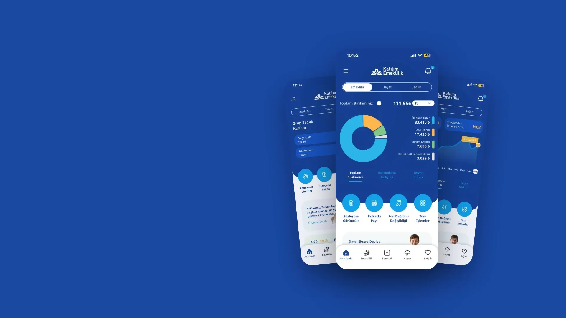
From savings to healthcare, every need in a single mobile experience.

Bringing two separate applications together goes beyond simply combining screens.
Katılım Mobile offered its services across private pension, life insurance, and healthcare through two separate mobile applications. Users had to switch between different apps to track their savings, manage their insurance policies, or access healthcare services.
We reimagined Katılım Mobile's digital experience by bringing both applications together on a single platform. Our goal was to create an intuitive and seamless mobile experience that enables users to easily manage everything from their financial savings to their healthcare needs.
Result: We brought healthcare, savings, and trust together in a single mobile experience.
Our goal was to bring pension and healthcare services together on a single mobile platform, enabling users to manage all their processes from one place.
In addition, we aimed to:
On mobile. In one app. In control.
We brought more than just services together. We put users’ health, savings, and peace of mind under one digital roof.
Users had to rely on two different mobile applications to track their pension savings and access healthcare services. This meant switching between different screens and accounts to meet different needs, making it difficult to deliver a consistent digital experience.
On top of that, complex financial terminology, hard-to-access emergency healthcare services, and documents scattered across different sections made it harder for users to complete the tasks they needed.
To build the new experience on data rather than assumptions, we conducted a four-stage research process.
From usage data analysis and competitor research to synthetic user interviews and persona development, each stage informed the next and helped shape our design decisions.
We analyzed usage data from both apps to identify the most frequently used features, abandoned flows, and points where users switched between applications.
We benchmarked pension, insurance and digital banking apps in terms of information architecture, financial data presentation and self-service capabilities.
We conducted interviews with synthetic users representing different age, income and digital proficiency profiles to quickly test their needs, expectations, and pain points.
We combined data and interview findings to develop personas representing different needs and behavioral patterns, then shaped our design decisions around their journeys.
KEY FINDINGS
Users had to switch between apps to manage their savings and healthcare needs.
Technical terminology and tables made decisions about fund allocation and contribution amounts difficult for users.
Users expected immediate access to essential services such as in-network healthcare providers, pharmacies and emergency assistance.
Field research and persona interviews revealed that users needed guidance when making important financial decisions, such as adjusting their fund allocation or contribution amounts.
Users wanted to understand how to make the most of their savings and what benefits they could gain by increasing their contributions. This highlighted the need for a more intuitive experience, free of technical jargon, where users could compare options and explore potential outcomes with ease.
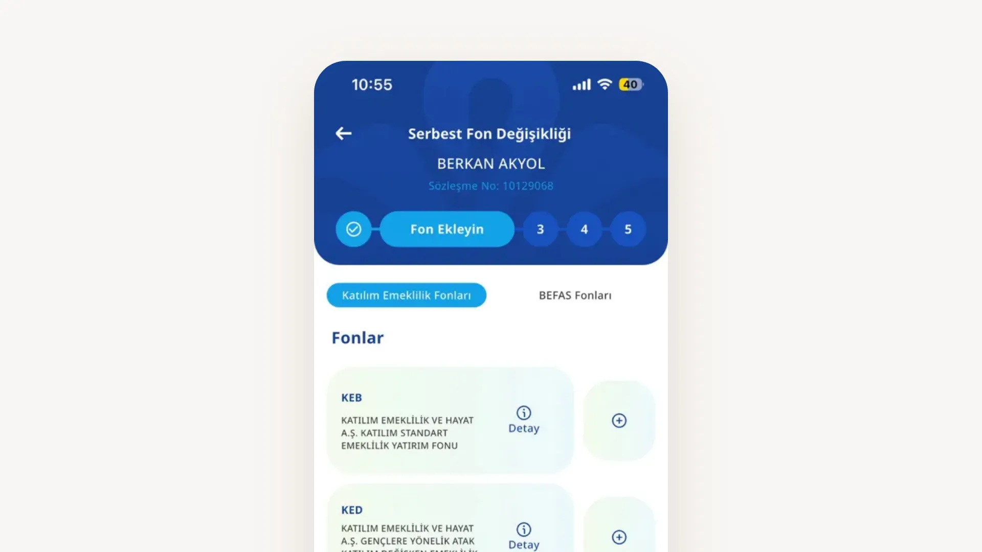
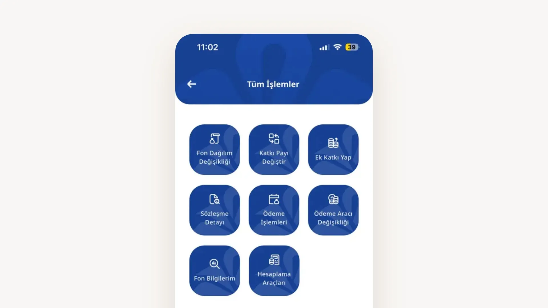
We redesigned the Katılım Mobile as an integrated experience, enabling users to manage their different needs from a single place.
Built around the idea of “My health and my savings, right at my fingertips,” the experience brings different service flows together in one seamless user journey.
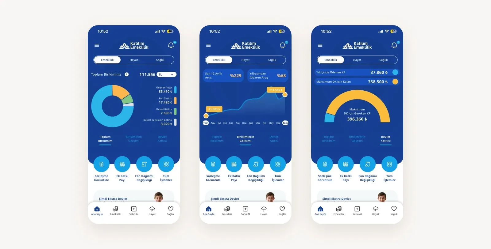
We made pension and healthcare services accessible from a shared home screen. By organizing different service areas with clearly defined tabs, color coding and card-based layouts, we made it easier for users to find the information they need.
We placed key information, such as total savings, vested state contribution and remaining healthcare coverage limits, where users could see it at a glance.
Rather than presenting fund and contribution processes through technical tables alone, we enhanced them with visual comparisons and interactive simulations.
We designed tools that help users better understand the potential impact of contribution changes, explore return scenarios and assess the benefits of state contributions.
This turned financial decision-making into a clearer, more guided experience.
We brought essential services such as searching for in-network hospitals, finding on-duty pharmacies and calling an emergency ambulance to easily accessible areas of the app.
By making these features available on both the login screen and the home page, we enabled users to take action quickly whenever they needed them.
We brought document and request processes together in a single digital experience. We designed an integrated document archive where users can upload invoices using their camera, track pre-authorization approvals, and download and share their insurance policy and pension documents in PDF format.
This allows users to complete a wide range of tasks directly in the app, without having to rely on different channels.
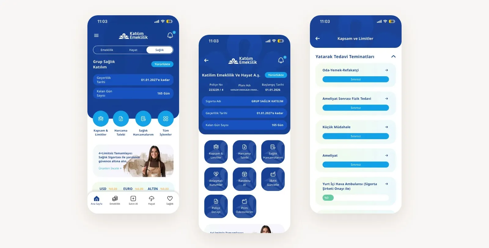
By bringing Katılım Mobile's two separate mobile apps together on one platform, we created a more integrated, intuitive and accessible digital experience.
With visual tools that simplify financial processes, quick access to healthcare services and end-to-end self-service features, we created a mobile ecosystem where users can take care of their needs in one place.
We transformed Katılım Mobile's digital ecosystem into an integrated experience that makes life easier for users, both today and in the future.
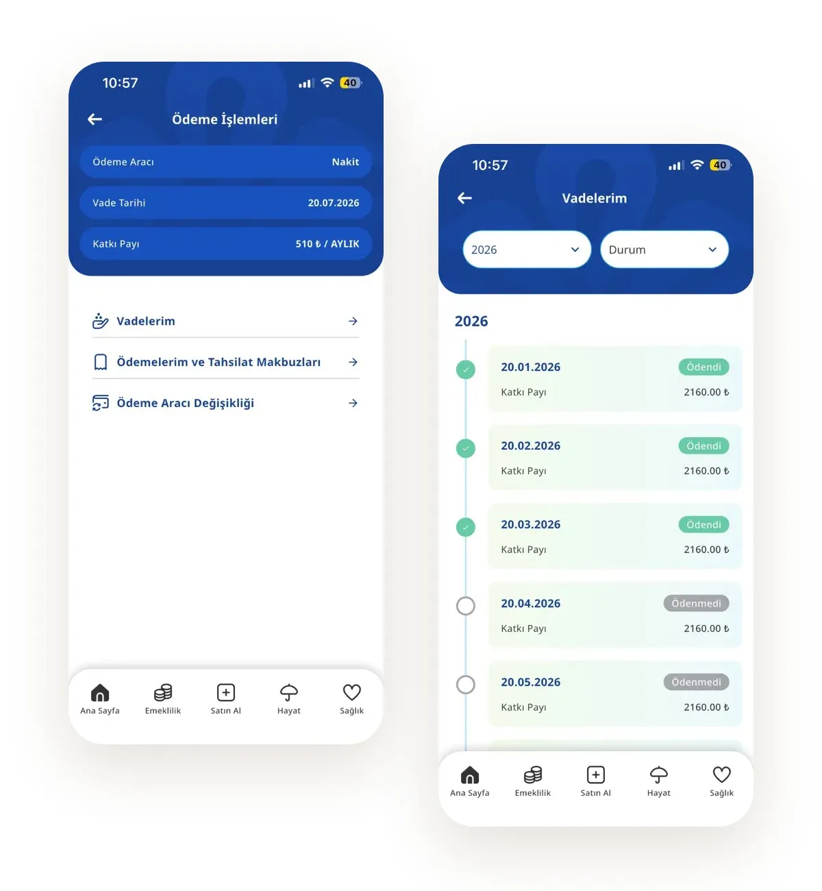
Because bringing two applications together is not simply about consolidating screens under one roof;
And that’s exactly what we did for Katılım Mobile.